
Claro Case Study
Claro
An AI co-pilot for the job search
I built a product from scratch using AI as my implementation partner. No engineering background. Just a clear problem, a strong point of view, and a lot of iteration.
My Role
Product, Brand, Design, Strategy
Timeline
2025 – 2026
Stack
Next.js · Supabase · Claude API · Vercel
Live at
claroapp.co
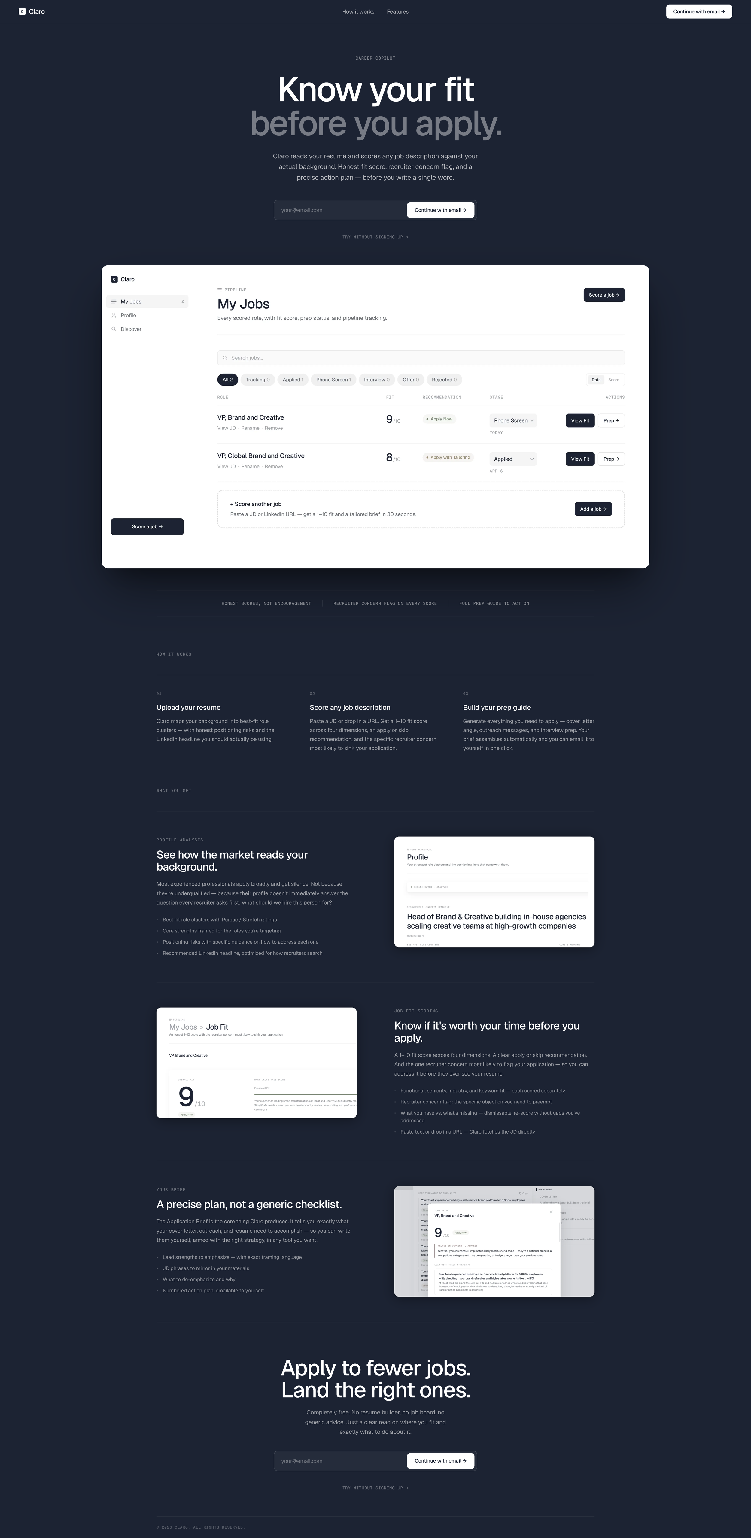
claroapp.co: dark navy landing page with product preview. Built as a full marketing page, not just a logged-out shell.
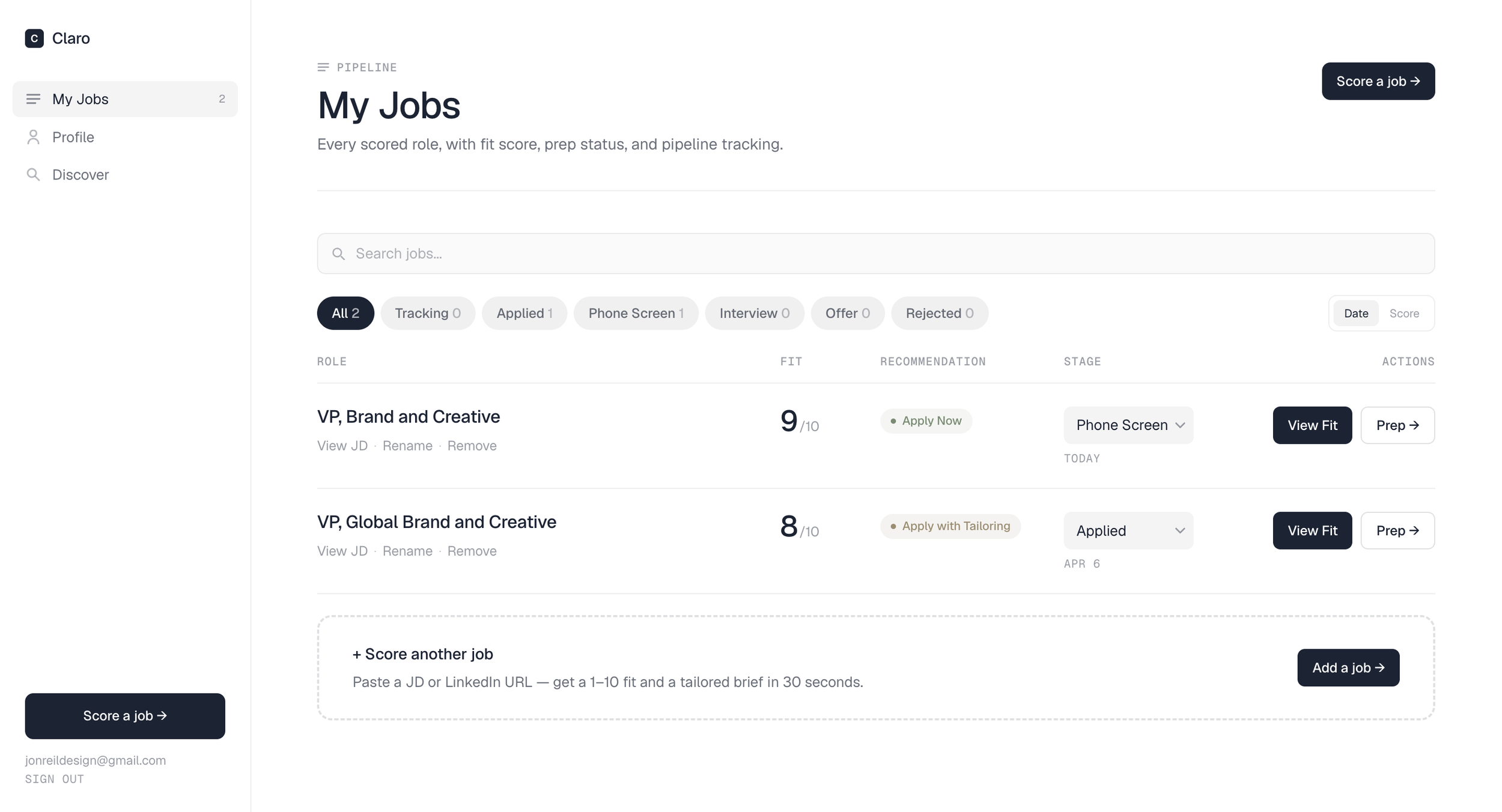
My Jobs: every scored role with fit score, pipeline status, and one-click access to Job Fit and Prep
Where it Started
My wife was getting nothing but silence
She has a strong background and was applying to roles and hearing nothing. Job boards surfaced volume. Generic AI tools gave generic advice. Nothing could tell her: here's how a recruiter is actually reading your background, and here's what to do about it. That gap felt solvable, so I built it.
I set out to solve a problem for one person. I kept going once I realized it wasn't specific to her at all.
I directed every decision: product strategy, information architecture, brand voice, design system, UX behavior. Claude Code implemented them precisely. Every session had a defined goal and explicit guardrails about what not to touch. The result is a production-deployed application I couldn't have written by hand. But everything it does came from decisions I made.
Product strategy
IA
Brand identity
AI tool direction
UX design
Design systems
Prompt engineering
Voice and tone
Product Strategy
Figure out the core thing. Then build around it.
The first real decision was figuring out what Claro was actually for. AI-powered tools tempt you to do everything. I landed on a clear center of gravity: job fit clarity. The simultaneous analysis of a candidate's profile against a specific role. Once you know your fit, what to emphasize, and what concern a recruiter is likely to raise, everything else has direction. Cover letters, outreach, and interview prep are all in the product, but they work because the fit assessment came first.
-
The diagnostic layer is Claro's core value. Cover letters and outreach are better when they come from a clear read on fit. So that's what the product leads with.
-
Every prompt tells the AI not to soften weaknesses. The recruiter concern is always visible. Fit scores are honest. That's not a tone choice. It's the product's reason to exist.
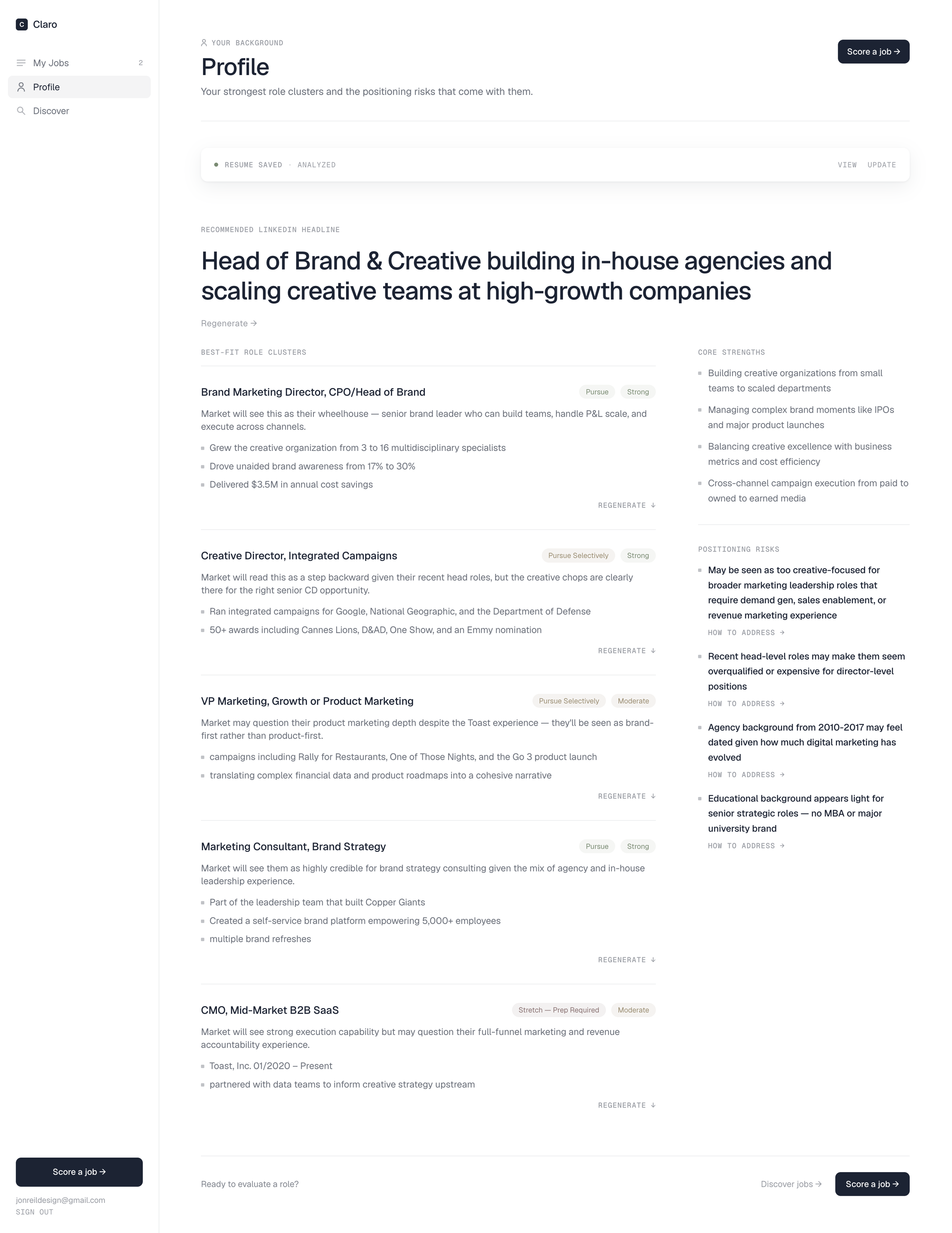
Profile: role clusters, positioning risks, and a recommended LinkedIn headline
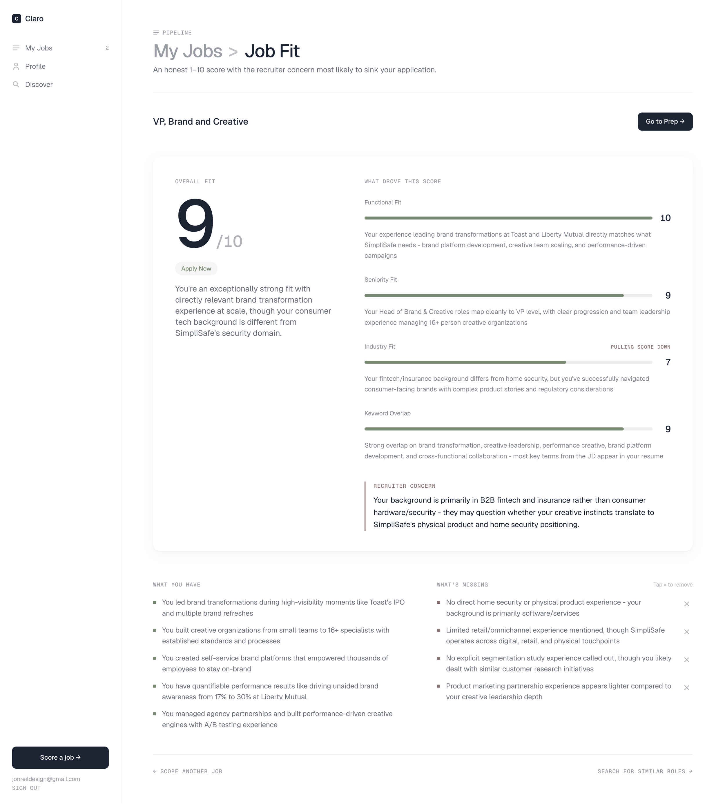
Job Fit: 1–10 score with dimension breakdown and recruiter concern
Brand and Design
The product needed a point of view
The name came early. Claro, from the Spanish for "clear." Short, ownable, not tech-y. It should feel like a strategic advisory service, not a startup. The first version was called Signal and had a colder, more utilitarian look. The second version moved toward warm and editorial: off-white, serif type, considered spacing. Closer, but it still read as AI-generated. The third version is where it landed: Geist throughout, true white and dark navy, no serifs, no warmth. Confident and geometric. The kind of design that doesn't announce itself.
-
White app interior, dark navy landing page, Geist throughout. Status colors are desaturated and functional: sage, slate, stone. The system is monochromatic by design. Color only appears where it carries information.
-
Claro speaks like someone who has read a lot of job descriptions and doesn't have time for cliches. "Spearheaded," "leveraged," "uniquely positioned," and "aligns perfectly" are banned at the system prompt level across all twelve API routes.
Before and After
Designing with AI: from warm editorial to confident geometric
The second version used a warm off-white palette, DM Serif Display for all display type, and an editorial aesthetic borrowed from print. It was considered and intentional. It still read as AI-generated. That combination had become a signature of AI-built products. That was the problem.
I used Claude Design to explore a new direction: answering questions about typeface, surface color, layout, and status palette before seeing a single mockup. The output was a high-fidelity prototype I could react to, iterate on, and hand off to Claude Code as a precise implementation reference.
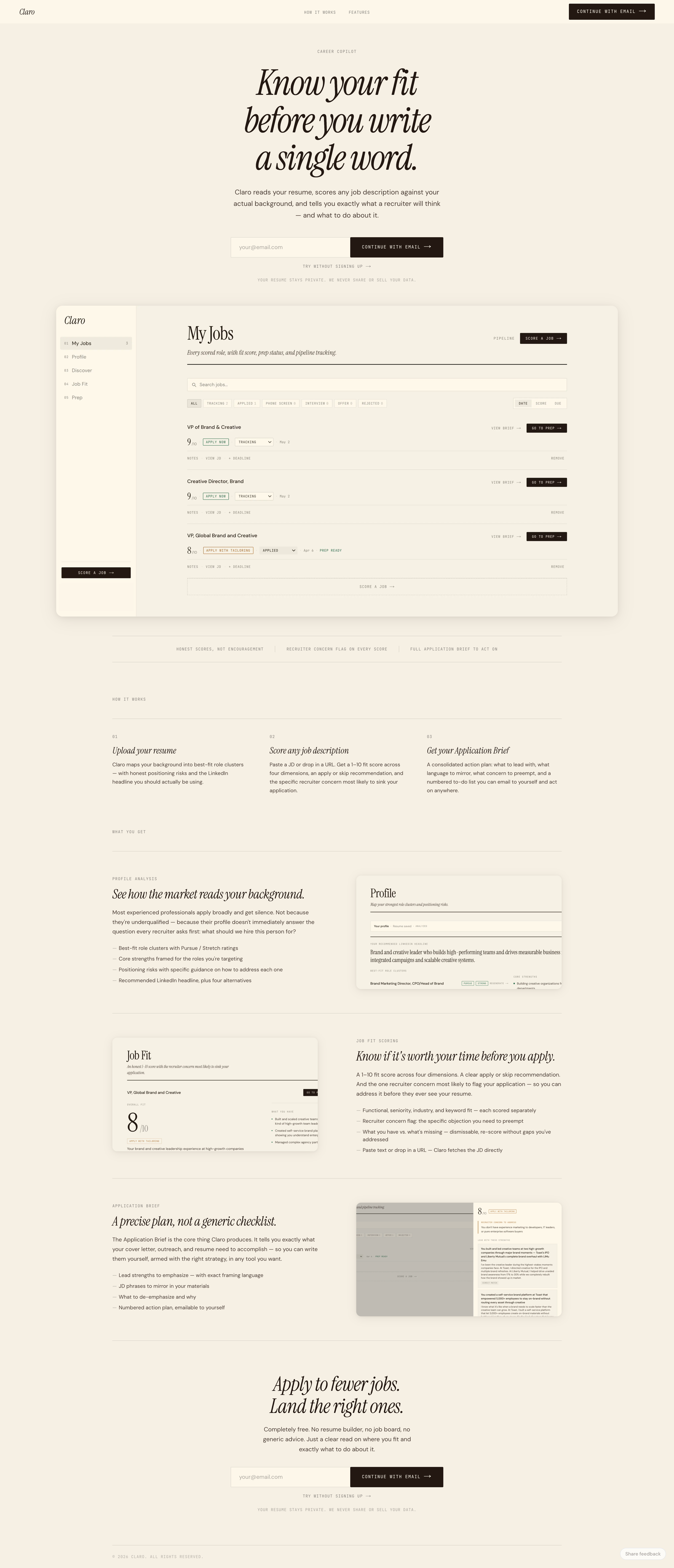
Before: warm off-white, DM Serif Display, editorial aesthetic
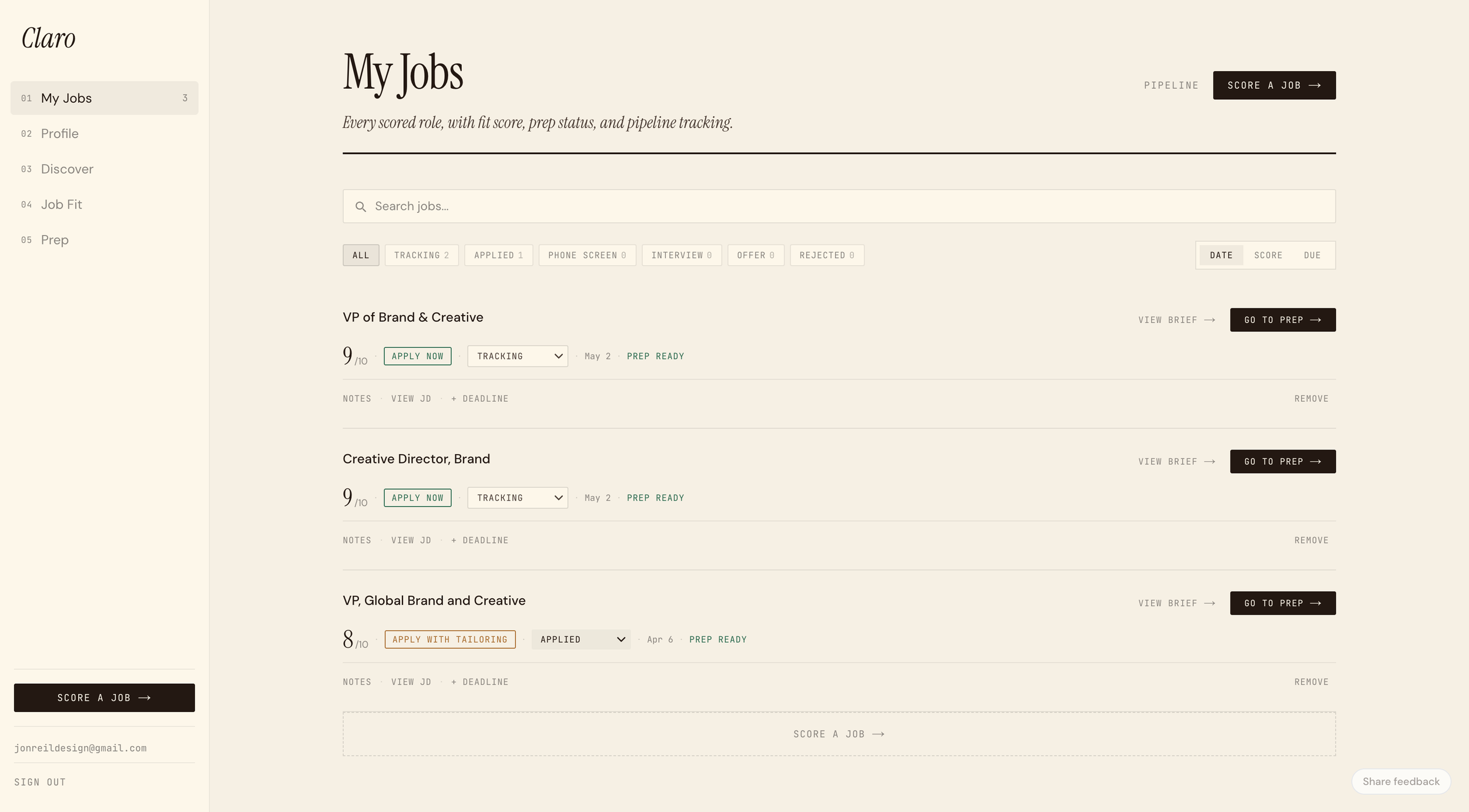
Before: warm off-white interior, serif type, card-based job list
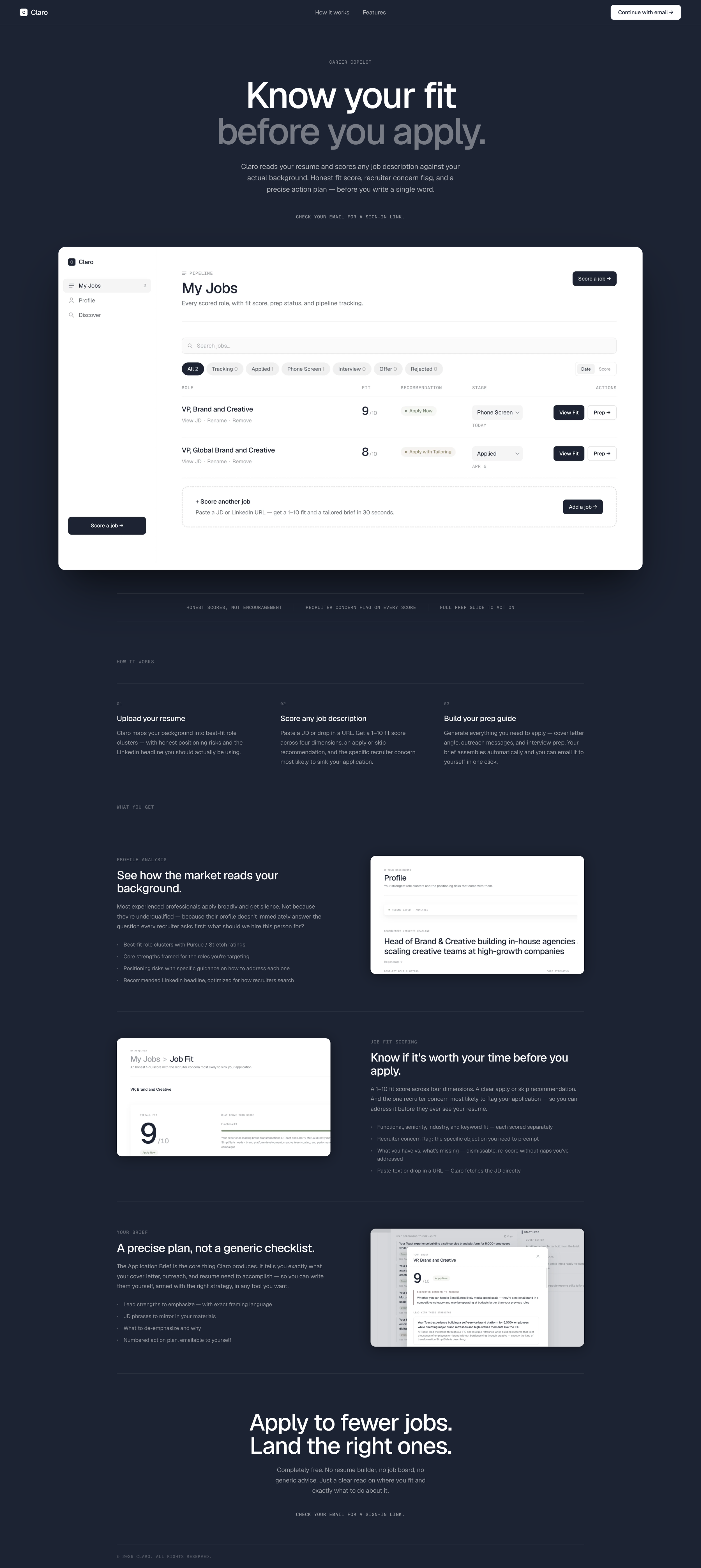
After: dark navy landing, Geist, monochromatic system
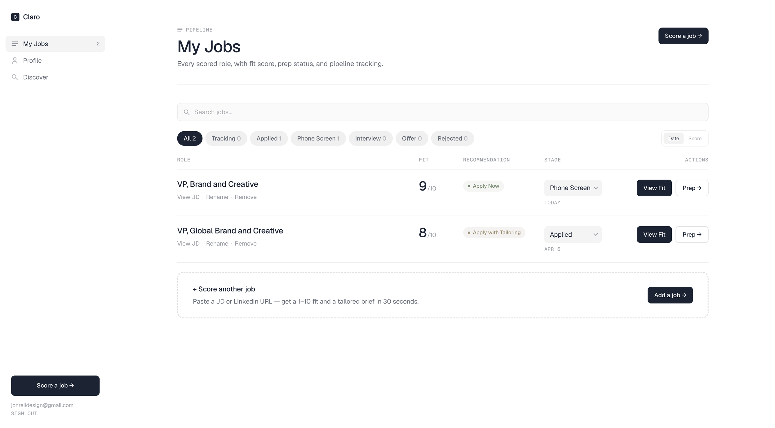
After: white interior, table layout, geometric type system
The Design Process
Claude Design as a creative direction tool
Before generating any mockups, Claude Design asked a series of questions: typeface direction, surface color, layout vibe, fit score treatment, card density, status palette. Answering those questions precisely (geometric sans, dark navy, Linear-style layout, open and breathable) produced a first pass that was already close to right.
The key moment was the surface comparison: dark landing page on the left, light on the right, same layout, one variable changed. The dark version was immediately right. That single decision, confirmed in seconds by seeing both options side by side, set the tone for the whole system. From there it was iteration, not exploration.
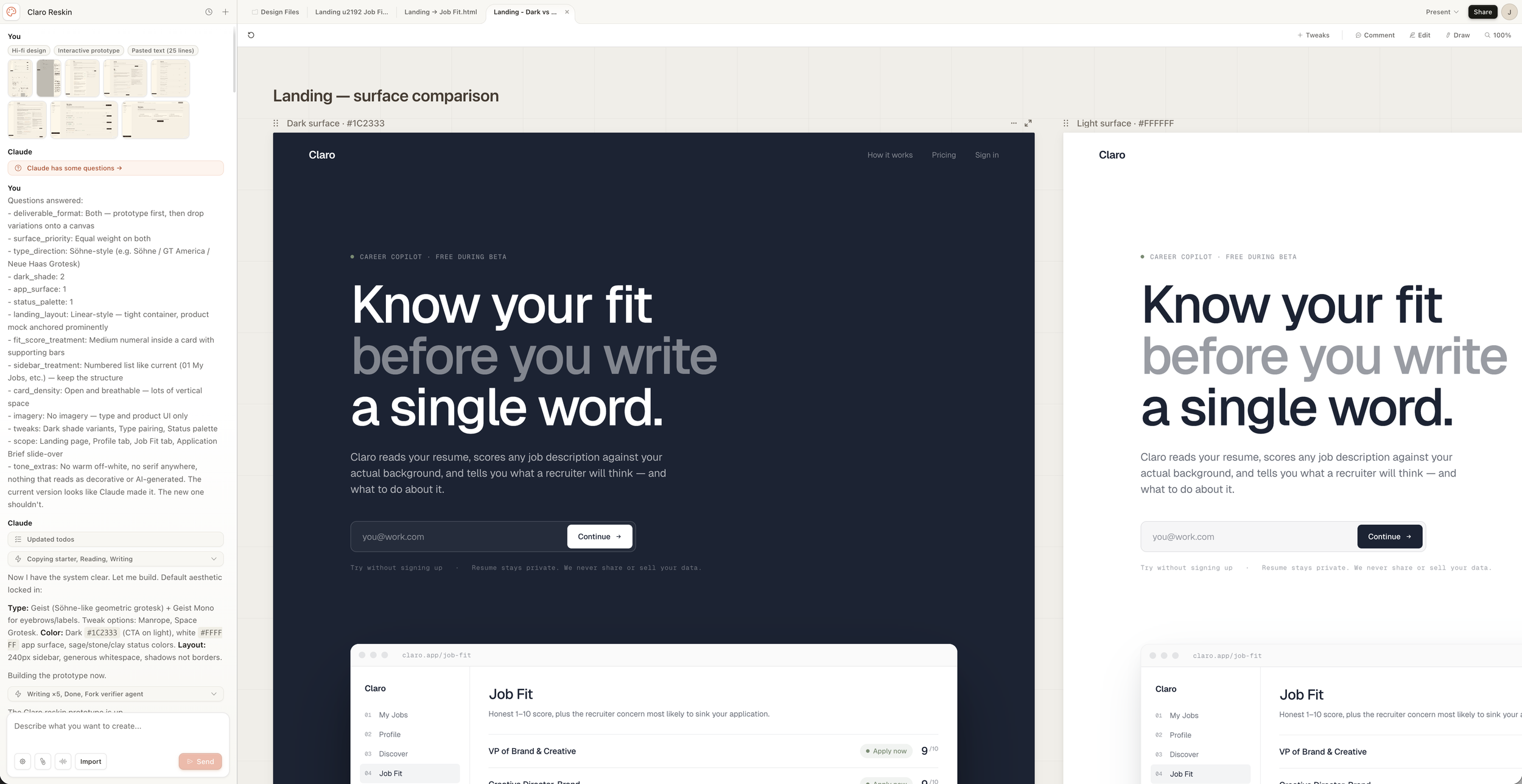
Surface comparison: the decision that set the tone for the whole system
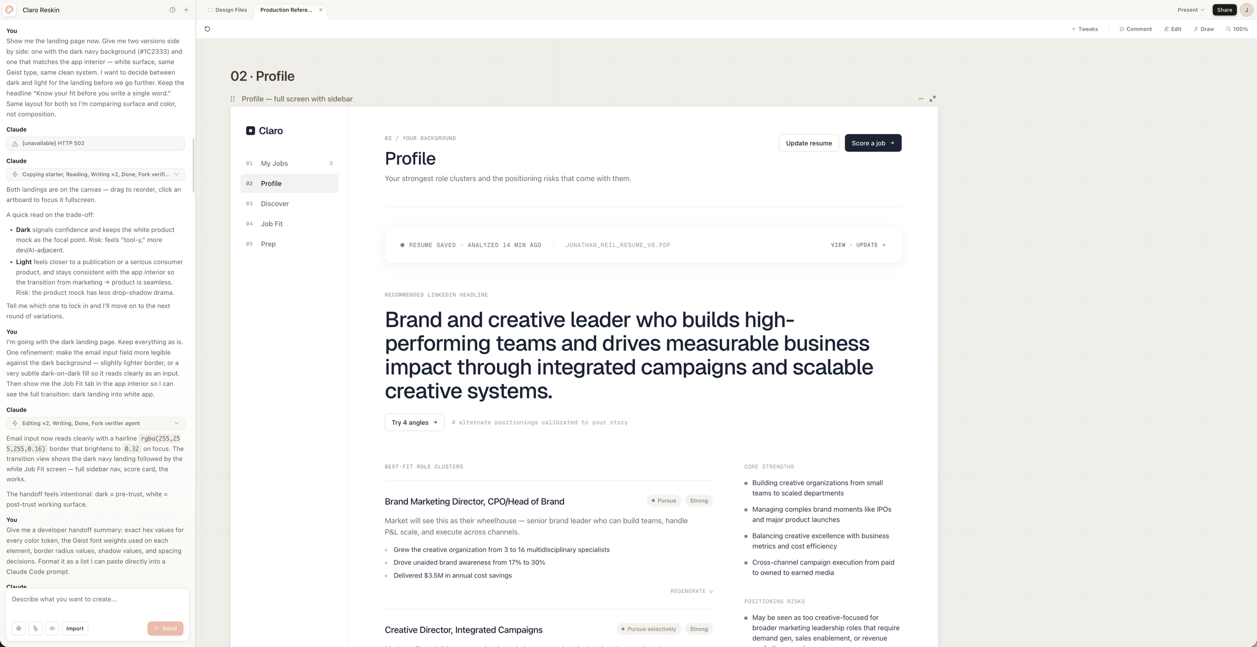
Design decisions logged, prototype files generated alongside
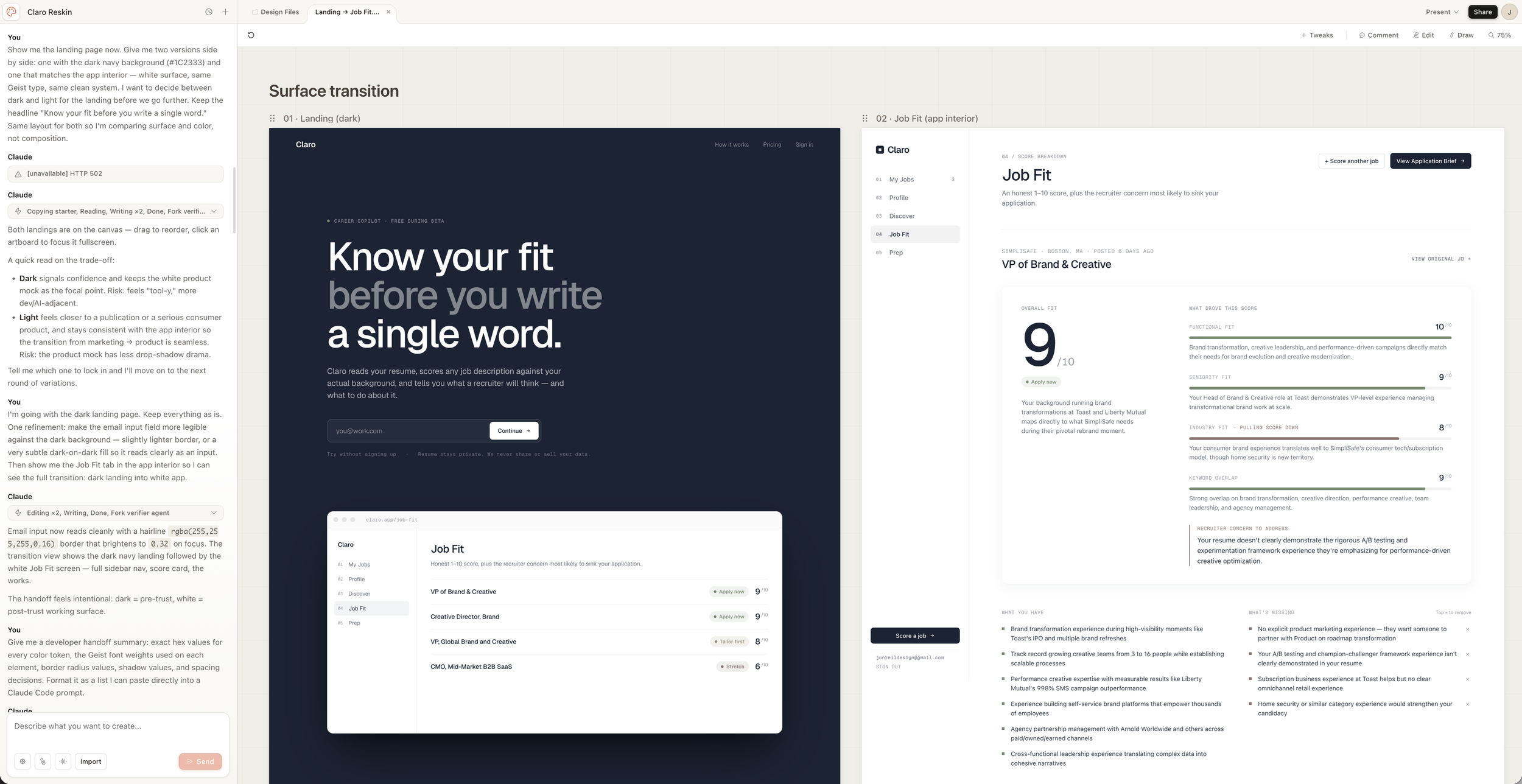
Surface transition canvas: dark entry, white working tool. A deliberate product decision.
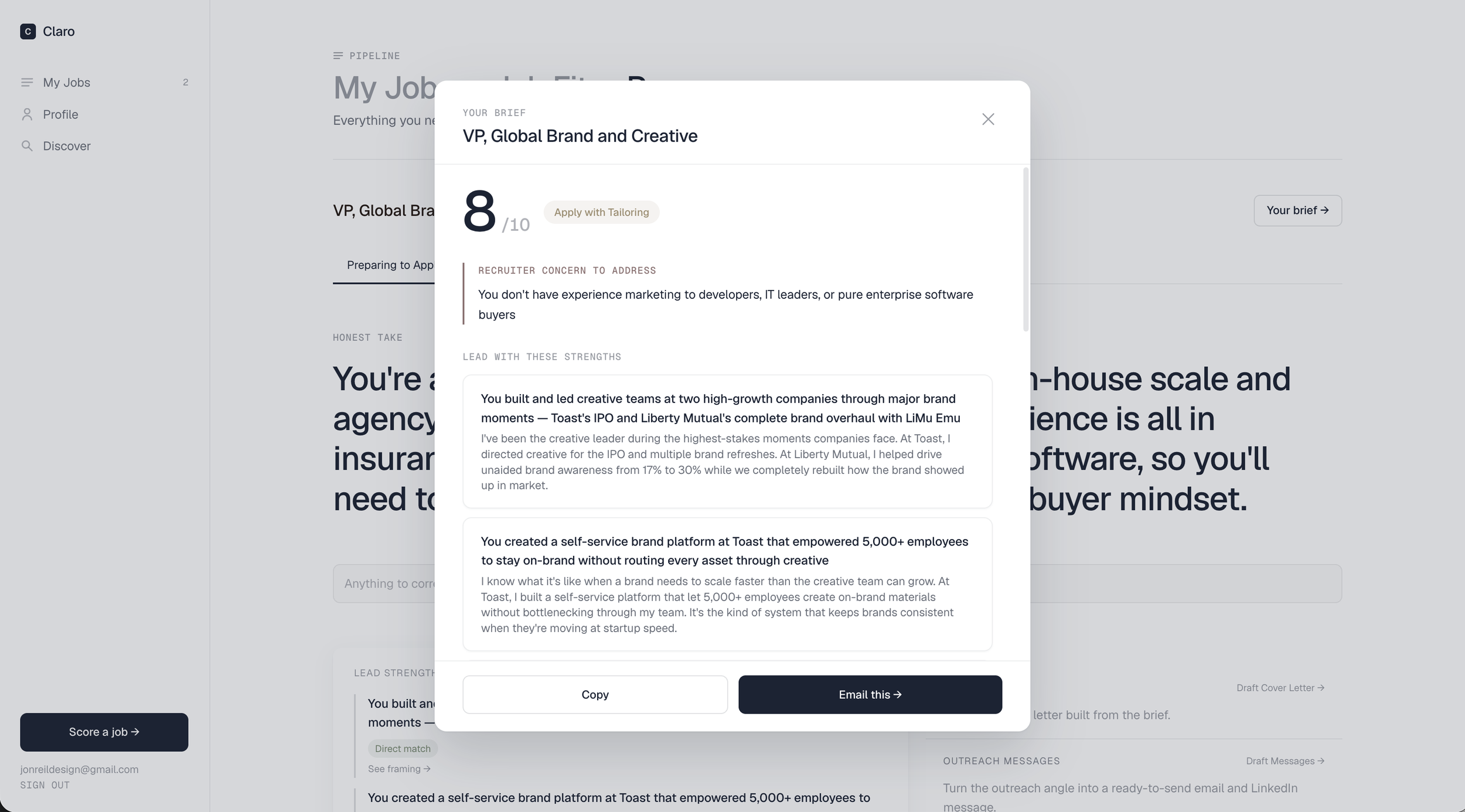
Your Brief: assembled from stored data, triggered from the Prep screen. Copy or email in one click.
UX Decisions
Navigation should reflect how people actually use the product
The original app had five sidebar nav items: My Jobs, Profile, Discover, Job Fit, and Prep. The problem was that Job Fit and Prep aren't destinations: they're things you do to a specific job. Treating them as top-level nav implied they were independent tools. They're not.
I removed them from the sidebar entirely. My Jobs, Profile, and Discover are the three destinations. Job Fit and Prep are accessed through the job workflow: View Fit from a job row, then Prep from Job Fit. A breadcrumb navigation on those screens shows where you are and lets you move between stages. The sidebar got simpler. The mental model got clearer.
-
The flow is: score a job, review fit, build prep, send brief. Every navigation decision reinforces that sequence. Nothing lives outside it.
-
The Application Brief was originally a slide-over panel accessible from My Jobs. It's now a modal triggered from the Prep screen after prep is generated. It's the output of doing the work, not a place you navigate to.
Validation
Real feedback, applied immediately
The app has been in active use with real test users, one being a senior professional navigating a deliberate career move. Her feedback shaped the product more than any other input. The Prep tab originally showed all seven features at once. She found it overwhelming. I added progressive disclosure by stage. Her response: "so much better." The email-brief feature came from her pointing out that a brief is only useful if it's in her workflow when she's actually writing.
When I asked if she'd pay for it, she said yes. That's the signal that matters at this stage.
12
Claude API routes, all rate-limited and production-deployed
3
Sidebar destinations: My Jobs, Profile, Discover. Everything else is a workflow.
0
Lines of code written by hand
What This is About
The gap between having an idea and building a product is closing fast
The skills that make someone good at brand strategy, creative direction, or product leadership translate directly into building with AI. Knowing what you want, being specific about it, and being willing to iterate when you're wrong. The tools are different. The thinking is the same.